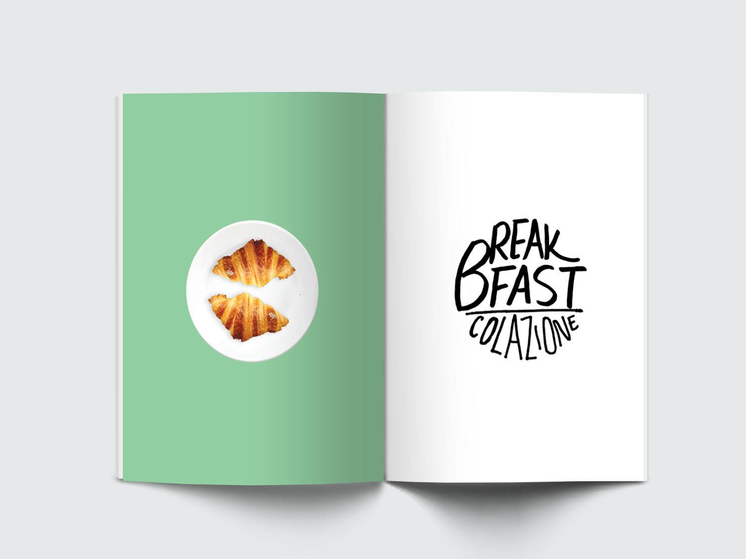
Book Design: Illustration & Layout


For my Branding & Identity course at NABA, I wrote and designed a guidebook of Milan. From layout to hand-drawn illustrations, I focused carrying on a visual identity that tells a cohesive story from page to page, where design creates a memorable experience that readers/users love, and nothing feels out of place. How does that experience carry on to digital products? By developing a strong visual identity and its branding assets, and focusing on delivering the value of the book, I was able to create an experience that was not only consistent, but also meaningful, across web and mobile.


From a landing page, to an app that builds an audience and community for the book, maintaining the visual consistency of hand-drawn illustrations and typography was a challenge. My goal was to find the balance between the hand-drawn assets and the digital fonts, without losing its identity. Just like the book, the heading of a section continues to have the hand-drawn type, while the subtext and the paragraph are displayed in digital fonts.

Building an audience of dedicated followers is essential in print and digital product design. I wanted to design an immersive experience that appeals to the audience of young food fanatics - locals and travelers - who wants to discover the best places to eat in Milan.
Munchies Meet is a mobile product created to build this community that introduces a different way of meeting new people. People can join a group of others who wants to meet and eat together - from breakfast, lunch, dinner, and dessert, at restaurants that were recommended in the book. They can also create their own event, so others can join them.
